
Website Accessibility: Top 5 Tips to Improve Usability
Read More
Options for accessing the web have exploded beyond desktop displays with the introduction of tablets, mini-tablets and smartphones. Because of this, variations in supported display dimensions have grown significantly. Having a website that is easily viewable in all formats is essential.
Important News: Google Officially Announces that Mobile-Friendly Websites will Rank Better in Search Results
We work with our clients to ensure that their website or web application is responsive to various mobile device screen sizes. Our designers and developers take care to ensure that your brand is carried over through multiple devices.
Creative elements are important when designing a website, but usability is essential. It won't matter how nice looking a website is if visitors are not able to use the site effectively. Beginning with the lowest common denominator (most often smartphones), functionality is added to the user experience as the layout capabilities of each device increase. This is referred to as progressive enhancement. We pay extra attention during the design of each layout design to ensure that no critical elements are eliminated or rendered useless based on device capabilities.
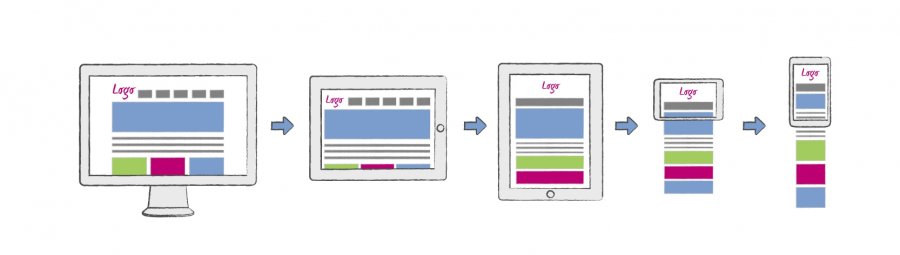

As mobile device capabilities continue to evolve and expand, responsive websites are capable of adapting to new capabilities with ease. Additional display dimensions can be added increasing the longevity of the website.
In addition to overall ease of use for the end-user, search engines have identified the value of responsive web design as well. Citing the ease of a single URL for both desktop and mobile users, both Bing and Google mention responsive website design as the preferred method of providing a mobile experience for users.