

When people think of a great website, they don’t often think of the various buttons throughout the pages. There are plenty of factors that go into a quality site: functionality, design, user experience, mobile capability, and great content – all presented in a concise, visually appealing way.
The buttons never get the spotlight. Until now.

Call-to-action buttons guide your visitors toward a specific goal conversion, so they need to look great. If you don’t want users to contact you, fill out a form, or make a purchase then, sure, skip the buttons. But if you do want to encourage some site engagement, call-to-action buttons are a must.
Your website could look immaculate in every way except the CTA buttons and that will drastically impact your ability to convert those users. For example, imagine a nice, sleek, modern site. Maybe something cool and luxurious like fancy watches or Michael Jordan’s tequila. Now imagine underneath that sophisticated and bold content is a CTA button that looks like this…

The product might look great. The site might look amazing. But is anyone going to actually “Click here” on a button like that?
Button Design: Brand Colors
It's imperative that you align your site button colors with your brand identity. That doesn’t mean every HTML button color needs to be the exact same as your logo, but you should at least be cognizant of colors that will compliment your brand – not hinder it. If your brand is all about creativity, happiness, and serenity, then dark blacks and intimidating reds probably aren’t your best bet.
It’s worth repeating: NEVER go against your brand colors when you’re making a design color choice for your buttons.
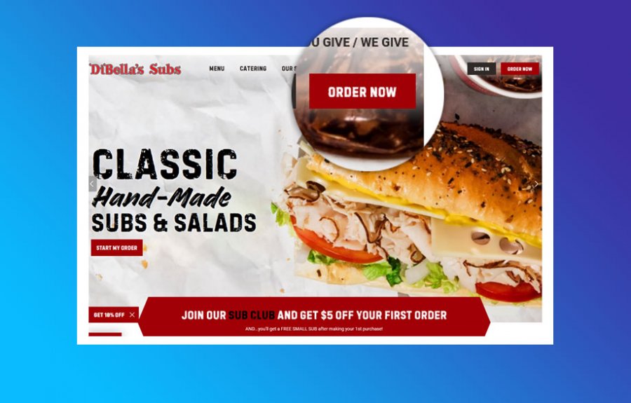
Example: Dibella's Subs
While designing CTA buttons, you should always be looking for the best ways to reach more customers and encourage them to engage. If used correctly, simply placing the right button color on your site can improve conversions.
According to a study by CrazyEgg, roughly 85% of shoppers say that color is their primary reason for buying a product and 66% of people won’t purchase a product unless it comes in their preferred color. The same logic is applied to clicking a button on a website. If the user doesn’t like the look or the color scheme evokes some negative emotions, the only button they’re going to click is that little X at the top of their browser.

Let’s take a deeper dive into some of the most effective (if used correctly) colors for site buttons:
BLUE
Blue is associated with calmness, tranquility, and stability – making it one of the most popular color options for financial institutions. Blue is most effective whenever you’re projecting an image of dependability, reliability, and seriousness. If you’re selling life insurance, for example, a blue button on a white background can maximize engagement. Also, it’s worth noting that blue and yellow text together are regarded as the most readable color combination.
RED
Red is a tricky one. It can be powerful and is actually one of the top 3 button colors for clicks – which is the main objective. However, red can also give off an aggressive tone for an otherwise friendly brand. Red triggers action and is most effective for impulse choices. Still not convinced red is a strong color choice?
Researchers from the University of Durham found that athletes who wore red were actually more likely to beat their opponents. They published their findings in the journal Nature.
“We find that wearing red is consistently associated with a higher probability of winning,” said researchers Russell Hill and Robert Barton.
GREEN
Green’s big advantage comes from being associated with caring for the environment – always a good approach unless your company is actively trying to destroy the environment? That’s pretty evil stuff… but if that’s the case maybe avoid a green CTA button.
If your brand can tie into natural, organic, or environmentally friendly characteristics, green is the perfect color to use.
According to an Amasty Buy/Add to Cart Button Color study, at 21%, green is the most effective button color on sites that sell consumer electronics, slightly out-performing red. For comparison, grey was the least effective color (5%).
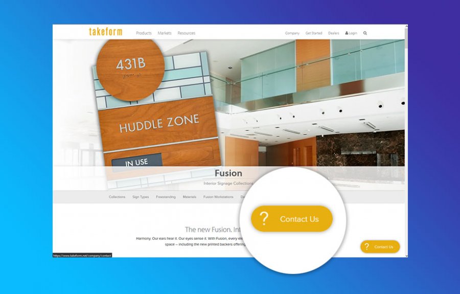
Example: Takeform Architectural Signage
Additional Call-to-Action Button Tips/Colors:
Your CTA buttons need to have a healthy contrast from your site’s background. If they do, you’ll likely see those buttons getting a lot more clicks.
Thinking about utilizing some other colors for your buttons? Here are some other popular options and how they can tie into your brand.
- Orange – Bright, bold color that promotes warmth and friendliness.
- Black – Powerful and bold. Used to market luxury products.
- Yellow – Optimistic and youthful color, often used to grab the attention of passersby.
- Pink – Feminine and romantic color historically used to market products to women and young girls.
- Purple – A creative color that symbolizes originality, awareness, and spirituality.
- Brown – no.
Lastly, try to mix up the text you’re using for those buttons, as well. You can play around with the text color but instead of using boring words like “enter” or “submit” try and replace them with more action-packed words like “Get” or “Try."
The colors and design of your site can actually influence purchasing habits of your visitors. So don’t just mishmash a few random colors together and throw them on a button. Using colors the right way can help get your customers to navigate to your product page, click that button, and make a purchase. Start paying attention to buttons a bit more while you’re interacting with a site. It might give you some ideas to improve your own site’s buttons.
How Corporate Communications Can Help
As a full-service digital marketing agency, one of our core specialties is custom web design. Our web designers can help create a consistent visual identity that matches your brand. Our goal is to design the best call-to-action buttons to increase user engagement and make your entire site stand out.
Start using colors more effectively to boost sales -- contact us today to get started!